```{r setup, include=FALSE}
options(htmltools.dir.version = FALSE)
```
# Hello World
Goals for today:
1. The p value understood through permutations
1. Testing associations between two continuous variables
1. Testing associations between one factor and one continuous variable
1. The linear model
1. From factors to numbers (understanding contrasts)
1. Linear mixed effects models
1. Logistic regression
---
# Reload the data
```{r}
suppressMessages(library(tidyverse))
mice <- read_csv("mice.csv") %>%
inner_join(read_csv("volumes.csv"))
```
---
class: smallercode
# Null hypothesis through simulations
```{r}
baseline <- mice %>% filter(Timepoint == "Pre1")
xtest <- with(baseline, chisq.test(Sex, Genotype))
simContingencyTable <- function() {
out <- matrix(nrow=2, ncol=3)
rownames(out) <- c("F", "M")
colnames(out) <- c("CREB -/-", "CREB +/-", "CREB +/+")
out[1,1] <- rbinom(1, 82, prob=xtest$expected[1,1] / 82)
out[2,1] <- 82 - out[1,1]
out[1,2] <- rbinom(1, 90, prob=xtest$expected[1,2] / 90)
out[2,2] <- 90 - out[1,2]
out[1,3] <- rbinom(1, 94, prob=xtest$expected[1,3] / 94)
out[2,3] <- 94 - out[1,3]
return(out)
}
simContingencyTable() %>% addmargins()
```
---
# Null hypothesis through simulations
```{r, cache=TRUE}
nsims <- 1000
simulations <- data.frame(chisq = vector(length=nsims),
p = vector(length=nsims))
for (i in 1:nsims) {
tmp <- chisq.test(simContingencyTable())
simulations$chisq[i] <- tmp$statistic
simulations$p[i] <- tmp$p.value
}
head(simulations)
```
---
# Null hypothesis through simulations
```{r, fig.width=12, fig.height=4.5}
ggplot() +
geom_histogram(data=simulations, aes(x=chisq, y=..density..),
binwidth = 0.5) +
geom_area(aes(c(0, 11)), stat="function",
fun=function(x) dchisq(x, 2), xlim=c(0,8),
fill="blue", alpha=0.5) +
annotate("text", c(5,5), c(0.325, 0.3), colour=c("black", "blue"),
label=c("Simulated", "dchisq")) +
theme_minimal(16)
```
---
# Null hypothesis through simulations
```{r}
xtest
mean(simulations$chisq > xtest$statistic)
```
---
# Null hypothesis through simulations
```{r, fig.height=6, fig.width=12}
ggplot() +
geom_histogram(data=simulations, aes(p, ..density..),
breaks=seq(0,1,length.out = 15)) +
theme_minimal(16)
```
---
# Null hypothesis through permutations
Basic idea: does the association between Genotype and Sex matter? If it does not, then switching it up should give similar answers.
```{r}
permutation <- baseline %>%
select(Genotype, Sex) %>%
mutate(permuted1=sample(Sex),
permuted2=sample(Sex),
permuted3=sample(Sex))
permutation %>% sample_n(6)
```
---
# Null hypothesis through permutations
```{r}
addmargins(with(permutation, table(Genotype, Sex)))
addmargins(with(permutation, table(Genotype, permuted1)))
```
???
Margins stay the same
---
# Null hypothesis through permutations
```{r, cache=TRUE}
nsims <- 1000
permutations <- data.frame(chisq = vector(length=nsims),
p = vector(length=nsims))
for (i in 1:nsims) {
permuted <- baseline %>% mutate(permuted=sample(Sex))
tmp <- with(permuted, chisq.test(Genotype, permuted))
permutations$chisq[i] <- tmp$statistic
permutations$p[i] <- tmp$statistic
}
mean(permutations$chisq > xtest$statistic)
xtest
```
???
Similar answer as parametric test
---
# Simulations and permutations
```{r, fig.width=12, fig.height=5}
data.frame(perms=permutations$chisq,
sims =simulations$chisq) %>%
gather(type, chisq) %>%
ggplot() + aes(chisq, fill=type) +
geom_histogram(position = position_dodge(),
binwidth = 0.5) +
theme_minimal(16)
```
???
Similar answer as Monte Carlo Simulation
---
# Review
--
$\chi^2$ test for two factors and contingency tables
--
Null hypothesis as the nil hypothesis: no association
--
p-value as the likelihood of a value equal to or more extreme occurring under the null hypothesis
--
p-value and null hypothesis as _long run probability_: if the experiment were repeated again and again and again, how often would certain outcomes occur?
--
Long run probability can be simulated by drawing random numbers/events from distributions under set assumptions. Sometimes called _Monte Carlo_ simulations or methods.
--
Dependence/independence can also be tested using _permutation tests_: shuffling the data to build an empirical distribution.
--
For our data, there was a sex bias, but it was equally biased across genotypes, and thus not a confound.
---
# Testing factors and continuous values
```{r, fig.width=12, fig.height=4.5}
baseline %>%
select(Genotype, Sex, `bed nucleus of stria terminalis`,
`hippocampus`) %>%
gather(structure, volume, -Genotype, -Sex) %>%
ggplot() + aes(Sex, volume) +
geom_boxplot() +
ylab(bquote(Volume ~ (mm^3))) +
facet_wrap(~structure, scales = "free_y") +
theme_gray(16)
```
---
# Aside: long vs wide data frames
```{r}
twostructs <- baseline %>%
mutate(bnst=`bed nucleus of stria terminalis`,
hc=hippocampus) %>%
select(Genotype, Sex, bnst, hc)
```
.pull-left[
```{r}
twostructs %>%
head
```
]
.pull-right[
```{r}
twostructs %>%
gather(structure, volume,
-Genotype, -Sex) %>%
head
```
]
---
# Means, variances, and standard deviations
```{r}
twostructs %>%
gather(structure, volume,
-Genotype, -Sex) %>%
group_by(structure, Sex) %>%
summarise(mean=mean(volume), sd=sd(volume),
var=var(volume), n=n())
```
---
# Student's t test
$$t = \frac{\bar{X}_1 - \bar{X}_2}{S_{\bar{\Delta}}}$$
where
$$S_{\bar{\Delta}} = \sqrt{\frac{s^2_1}{n_1} + \frac{s^2_2}{n_2}}$$
where $s^2_i$ is the sample variance and $\bar{X}_i$ is the sample mean.
---
# Student's t test
$$t = \frac{\bar{X}_1 - \bar{X}_2}{S_{\bar{\Delta}}}, S_{\bar{\Delta}} = \sqrt{\frac{s^2_1}{n_1} + \frac{s^2_2}{n_2}}$$
```{r, echo=FALSE}
twostructs %>%
gather(structure, volume,
-Genotype, -Sex) %>%
group_by(structure, Sex) %>%
filter(structure == "bnst") %>%
summarise(mean=mean(volume), sd=sd(volume), var=var(volume), n=n()) %>% knitr::kable(format='html')
```
```{r}
1.213525 - 1.270638
sqrt( (0.002797969/101) + (0.002787343/165) )
-0.057113/0.006677998
```
---
# Student's t test
```{r}
t.test(bnst ~ Sex, twostructs)
```
---
# df, degrees of freedom
$$df = \frac{(\frac{s^2_1}{n_1} + \frac{s^2_2}{n_2})}{\frac{(s^2_1/n_1)^2}{n_1 - 1}+\frac{(s^2_2/n_2)^2}{n_2-1}}$$
```{r, echo=F, fig.width=12, fig.height=5}
s <- data.frame(s=seq(-6, 6, length.out = 100)) %>%
mutate(df2 = dt(s, df=2),
df10 = dt(s, df=10),
df100 = dt(s, df=100),
df1000 = dt(s, df=1000)) %>%
gather(df, density, df2:df1000) %>%
mutate(df = factor(df, levels=c("df2", "df10", "df100", "df1000")))
s %>% ggplot() +
aes(x=s, y=density, colour=df) +
geom_line() +
scale_colour_viridis_d(option = "C", end=0.7) +
theme_minimal(16)
```
---
# df, degrees of freedom
$$\textrm{df} = \frac{(\frac{s^2_1}{n_1} + \frac{s^2_2}{n_2})}{\frac{(s^2_1/n_1)^2}{n_1 - 1}+\frac{(s^2_2/n_2)^2}{n_2-1}}$$
```{r, echo=F, fig.width=12, fig.height=5}
s <- data.frame(s=seq(-6, 6, length.out = 100)) %>%
mutate(df2 = pt(s, df=2),
df10 = pt(s, df=10),
df100 = pt(s, df=100),
df1000 = pt(s, df=1000)) %>%
gather(df, density, df2:df1000) %>%
mutate(df = factor(df, levels=c("df2", "df10", "df100", "df1000")))
s %>% ggplot() +
aes(x=s, y=density, colour=df) +
geom_line() +
scale_colour_viridis_d(option = "C", end=0.7) +
theme_minimal(16)
```
---
# Simpler version
Assuming equal variance for the two groups:
$$t = \frac{\bar{X}_1 - \bar{X}_2}{S_p \cdot \sqrt{\frac{1}{n_1} + \frac{1}{n_2}}}, S_p = \sqrt{\frac{(n_1 - 1)s^2_{X_1} + (n_2 - 1)s^2_{X_2}}{n_1 + n_2 - 2}}, \textrm{df} = n_1 + n_2 - 2$$
```{r}
t.test(bnst ~ Sex, twostructs, var.equal=TRUE)
```
???
In practice it rarely makes a difference - an equal variance will be assumed for linear models to be discussed later.
---
# t test on BNST
```{r}
t.test(bnst ~ Sex, twostructs)
```
---
# t test on hippocampus
```{r}
t.test(hc ~ Sex, twostructs)
```
---
# t test: significance through simulations
```{r}
simNullVolume <- function(sampleMean, sampleSD, n1, n2) {
simData <- data.frame(
volume = c(
rnorm(n1, sampleMean, sampleSD),
rnorm(n2, sampleMean, sampleSD)
),
group = c(
rep("G1", n1),
rep("G2", n2)
)
)
tt <- t.test(volume ~ group, simData)
return(c(tt$statistic, tt$p.value))
}
simNullVolume(20.02646, 0.9513596, 101, 165)
```
---
# An aside on the normal distribution
```{r, echo=F, fig.width=12}
ggplot() +
aes(c(-4,4)) +
geom_line(stat="function",
fun=function(x) dnorm(x)) +
ylab("p") +
xlab("z") +
ggtitle("Normal Distribution", subtitle = "With mean=0 and sd=1") +
theme_minimal(16)
```
---
# An aside on the normal distribution
```{r, echo=F, fig.width=12}
ggplot() +
aes(c(-4,4)) +
geom_line(stat="function",
fun=function(x) dnorm(x)) +
geom_area(stat="function",
fun=function(x) dnorm(x), xlim=c(-1,1), alpha=0.5) +
annotate("text", x=0, y=0.2, label="66.6% of distribution\n1 SD from mean", size=5) +
geom_area(stat="function",
fun=function(x) dnorm(x), xlim=c(-2,-1), alpha=0.5, fill="blue") +
geom_area(stat="function",
fun=function(x) dnorm(x), xlim=c(1,2), alpha=0.5, fill="blue") +
annotate("text", x=2, y=0.2, label="95% of distribution\n2 SD from mean", size=5, col="blue") +
geom_area(stat="function",
fun=function(x) dnorm(x), xlim=c(-3,-2), alpha=0.5, fill="dark green") +
geom_area(stat="function",
fun=function(x) dnorm(x), xlim=c(2,3), alpha=0.5, fill="dark green") +
annotate("text", x=3, y=0.1, label="99% of distribution\n3 SD from mean", size=5, col="dark green") +
ylab("p") +
xlab("z") +
ggtitle("Normal Distribution", subtitle = "With mean=0 and sd=1") +
theme_minimal(16)
```
---
# Central limit theorem
When independent random variables are added, they will eventually sum to a normal distribution
--
Example: dice. Toss of one 6 sided die:
```{r, fig.height=5, fig.width=12}
d1 <- floor(runif(1000, min=1, max=6+1))
qplot(d1, geom="histogram", breaks=1:6+0.5) + theme_minimal(16)
```
---
# Central limit theorem
Add a second dice
```{r, fig.height=5, fig.width=12}
d1 <- floor(runif(1000, min=1, max=6+1))
d2 <- floor(runif(1000, min=1, max=6+1))
qplot(d1+d2, geom="histogram", breaks=2:12+0.5) + theme_minimal(16)
```
---
# Central limit theorem
And a third
```{r, fig.height=5, fig.width=12}
d1 <- floor(runif(1000, min=1, max=6+1))
d2 <- floor(runif(1000, min=1, max=6+1))
d3 <- floor(runif(1000, min=1, max=6+1))
qplot(d1+d2+3, geom="histogram", breaks=3:18+0.5) + theme_minimal(16)
```
---
# t and normal distributions
```{r, echo=F, fig.width=12}
vcols <- viridisLite::plasma(3, end=0.7)
ggplot() +
aes(c(-4,4)) +
geom_line(stat="function",
fun=function(x) dnorm(x)) +
#geom_line(stat="function",
# fun=function(x) dt(x, 2), col=vcols[1]) +
#geom_line(stat="function",
# fun=function(x) dt(x, 10), col=vcols[2]) +
#geom_line(stat="function",
# fun=function(x) dt(x, 1000), col=vcols[3]) +
annotate("text", x=1+0.5, y=0.35, label="Normal distribution", size=5) +
#annotate("text", x=1.2, y=0.325, label="t distribution with df=2", size=5, col=vcols[1]) +
#annotate("text", x=1.4, y=0.3, label="t distribution with df=10", size=5, col=vcols[2]) +
#annotate("text", x=1.6, y=0.275, label="t distribution with df=1000", size=5, col=vcols[3]) +
ylab("p") +
xlab("z") +
ggtitle("Normal Distribution", subtitle = "With mean=0 and sd=1") +
theme_minimal(16)
```
---
# t and normal distributions
```{r, echo=F, fig.width=12}
vcols <- viridisLite::plasma(3, end=0.7)
ggplot() +
aes(c(-4,4)) +
geom_line(stat="function",
fun=function(x) dnorm(x)) +
geom_line(stat="function",
fun=function(x) dt(x, 2), col=vcols[1]) +
#geom_line(stat="function",
# fun=function(x) dt(x, 10), col=vcols[2]) +
#geom_line(stat="function",
# fun=function(x) dt(x, 1000), col=vcols[3]) +
annotate("text", x=1+0.5, y=0.35, label="Normal distribution", size=5) +
annotate("text", x=1.2+0.5, y=0.325, label="t distribution with df=2", size=5, col=vcols[1]) +
#annotate("text", x=1.4, y=0.3, label="t distribution with df=10", size=5, col=vcols[2]) +
#annotate("text", x=1.6, y=0.275, label="t distribution with df=1000", size=5, col=vcols[3]) +
ylab("p") +
xlab("z") +
ggtitle("Normal Distribution", subtitle = "With mean=0 and sd=1") +
theme_minimal(16)
```
---
# t and normal distributions
```{r, echo=F, fig.width=12}
vcols <- viridisLite::plasma(3, end=0.7)
ggplot() +
aes(c(-4,4)) +
geom_line(stat="function",
fun=function(x) dnorm(x)) +
geom_line(stat="function",
fun=function(x) dt(x, 2), col=vcols[1]) +
geom_line(stat="function",
fun=function(x) dt(x, 10), col=vcols[2]) +
#geom_line(stat="function",
# fun=function(x) dt(x, 1000), col=vcols[3]) +
annotate("text", x=1+0.5, y=0.35, label="Normal distribution", size=5) +
annotate("text", x=1.2+0.5, y=0.325, label="t distribution with df=2", size=5, col=vcols[1]) +
annotate("text", x=1.4+0.5, y=0.3, label="t distribution with df=10", size=5, col=vcols[2]) +
#annotate("text", x=1.6, y=0.275, label="t distribution with df=1000", size=5, col=vcols[3]) +
ylab("p") +
xlab("z") +
ggtitle("Normal Distribution", subtitle = "With mean=0 and sd=1") +
theme_minimal(16)
```
---
# t and normal distributions
```{r, echo=F, fig.width=12}
vcols <- viridisLite::plasma(3, end=0.7)
ggplot() +
aes(c(-4,4)) +
geom_line(stat="function",
fun=function(x) dnorm(x)) +
geom_line(stat="function",
fun=function(x) dt(x, 2), col=vcols[1]) +
geom_line(stat="function",
fun=function(x) dt(x, 10), col=vcols[2]) +
geom_line(stat="function",
fun=function(x) dt(x, 1000), col=vcols[3]) +
annotate("text", x=1+0.5, y=0.35, label="Normal distribution", size=5) +
annotate("text", x=1.2+0.5, y=0.325, label="t distribution with df=2", size=5, col=vcols[1]) +
annotate("text", x=1.4+0.5, y=0.3, label="t distribution with df=10", size=5, col=vcols[2]) +
annotate("text", x=1.6+0.5, y=0.275, label="t distribution with df=1000", size=5, col=vcols[3]) +
ylab("p") +
xlab("z") +
ggtitle("Normal Distribution", subtitle = "With mean=0 and sd=1") +
theme_minimal(16)
```
---
# Back to the simulation
```{r}
simNullVolume <- function(sampleMean, sampleSD, n1, n2) {
simData <- data.frame(
volume = c(
rnorm(n1, sampleMean, sampleSD),
rnorm(n2, sampleMean, sampleSD)
),
group = c(
rep("G1", n1),
rep("G2", n2)
)
)
tt <- t.test(volume ~ group, simData)
return(c(tt$statistic, tt$p.value))
}
simNullVolume(20.02646, 0.9513596, 101, 165)
```
---
# Back to the simulation
```{r, fig.height=3.5, fig.width=12}
nsims <- 1000
simulated <- data.frame(
tstats=vector(length=nsims),
pvals=vector(length=nsims))
for (i in 1:nsims) {
sim <- simNullVolume(20.02646, 0.9513596, 101, 165)
simulated$tstats[i] <- sim[1]
simulated$pvals[i] <- sim[2]
}
qplot(simulated$tstat, geom="histogram", binwidth=0.3) + xlab("t") + theme_minimal(16)
```
---
# Back to the simulation
```{r}
mean(simulated$tstats < -1.4813)
t.test(hc ~ Sex, twostructs)
```
---
# Two tails to the distribution
```{r}
mean(simulated$tstats < -1.4813 | simulated$tstats > 1.4813)
mean(abs(simulated$tstats) > 1.4813)
```
---
# p value through permutations
```{r, cache=TRUE}
nsims <- 1000
permuted <- data.frame(tstat=vector(length=1000),
pval=vector(length=1000))
for (i in 1:nsims) {
tmp <- twostructs %>%
mutate(pSex=sample(Sex)) %>%
t.test(hc ~ pSex, .)
permuted$tstat[i] <- tmp$statistic
permuted$pval[i] <- tmp$p.value
}
mean(abs(permuted$tstat)>1.4813)
```
---
# Review
_Central limit theorem_: most things we measure are made up of many additive components, and will likely be normally distributed.
--
Vaguely normally distributed data can be described by its mean and standard deviation
--
The t test assesses whether two groups differ in some (normally distributed) measure.
--
The t distribution is like the normal distribution but with heavier tails; its shape is defined by its degrees of freedom.
--
The null hypothesis is once again the nil hypothesis: the measure of interest comes from the same distribution in both groups.
--
Parametric assumptions, monte carlo simulations, and permutations can all be used to obtain the p value.
--
p value: how likely is this particular t statistic to occur if the measure is indeed derived from the same distribution in both groups.
---
# Equal variance t-test revisited
$$t = \frac{\bar{X}_1 - \bar{X}_2}{S_p \cdot \sqrt{\frac{1}{n_1} + \frac{1}{n_2}}}, S_p = \sqrt{\frac{(n_1 - 1)s^2_{X_1} + (n_2 - 1)s^2_{X_2}}{n_1 + n_2 - 2}}, \textrm{df} = n_1 + n_2 - 2$$
```{r}
t.test(hc ~ Sex, twostructs, var.equal=TRUE)
```
---
# Let's rewrite the equal variance t-test
```{r}
twostructs %>%
mutate(sex2 = ifelse(Sex == "F", 1, 0),
int = 1) %>%
select(-bnst) %>%
sample_n(8)
```
---
# Still rewriting the t-test
```{r}
X <- twostructs %>%
mutate(Sex = ifelse(Sex == "F", 1, 0),
Intercept = 1) %>%
select(Intercept, Sex) %>%
as.matrix
y <- twostructs$hc
solve(t(X)%*%X)%*%t(X)%*%y
```
---
# Still rewriting the t-test
```{r}
solve(t(X)%*%X)%*%t(X)%*%y
t.test(hc ~ Sex, twostructs, var.equal=TRUE)
```
---
# The linear model
```{r}
X <- twostructs %>%
mutate(Sex = ifelse(Sex == "F", 1, 0),
Intercept = 1) %>%
select(Intercept, Sex) %>%
as.matrix
y <- twostructs$hc
solve(t(X)%*%X)%*%t(X)%*%y
```
In matrix notation:
$$y = X\beta + \epsilon$$
--
Or, in algebraic notation:
$$y = \alpha + \beta X + \epsilon$$
???
Allude to 0 and 1 as contrasts
---
# Linear model terminology
$$y = \alpha + \beta X + \epsilon$$
|y|=|α|+|β|X|+|ε|
|-|-|--------|-|-------|---|-|----------|
|Response||Intercept||Slope|regressor||error|
|dependent variable|||||independent variable||
|outcome|||||covariate||
--
```{r}
lm(hc ~ 1 + Sex, twostructs)
```
---
# Linear model
$$y = \alpha + \beta X + \epsilon$$
$X$ can be anything numeric, for example
```{r}
lm(hippocampus ~ Age, baseline)
model.matrix(lm(hippocampus ~ Age, baseline)) %>% head
```
---
# Least squares
Method of least squares: line can be fitted such that errors are minimized.
One can determine α and β such that the sum of the squared distances between the data points and the line is minimized
---
# Your turn
```{r, echo=F, fig.width=12}
theme_set(theme_classic(16) + theme(panel.grid.major = element_line(size = 0.5)))
p1 <- ggplot(baseline) + aes(hippocampus, medulla) + geom_point()
lmS1 <- data.frame(x=c(1,1,4,5), y=c(2,4,5,6))
lmS1$predicted <- predict(lm(y~x, lmS1))
lmS2 <- data.frame(x=c(1,1,4,4), y=c(2,4,2,4))
lmS2$predicted <- predict(lm(y~x, lmS2))
lmS3 <- data.frame(x=c(1,2,3,3,4,5), y=c(2,3,3,1,2,3))
lmS3$predicted <- predict(lm(y~x, lmS3))
p2 <- ggplot(lmS1) + aes(x=x, y=y) + geom_point() + scale_x_continuous(limits=c(0,6)) + scale_y_continuous(limits=c(0,6))
p3 <- ggplot(lmS2) + aes(x=x, y=y) + geom_point() + scale_x_continuous(limits=c(0,6)) + scale_y_continuous(limits=c(0,6))
p4 <- ggplot(lmS3) + aes(x=x, y=y) + geom_point() + scale_x_continuous(limits=c(0,6)) + scale_y_continuous(limits=c(0,6))
suppressMessages(library(ggpubr))
ggarrange(p1, p2, p3, p4, ncol=2, nrow=2, align="hv")
```
---
# The answer
```{r, echo=F, fig.width=12}
p1 <- p1 + geom_smooth(method="lm", se=F)
p2 <- p2 + geom_smooth(method="lm", se=F, fullrange=T)
p3 <- p3 + geom_smooth(method="lm", se=F, fullrange=T)
p4 <- p4 + geom_smooth(method="lm", se=F, fullrange=T)
ggarrange(p1, p2, p3, p4, ncol=2, nrow=2, align="hv")
```
---
# Showing the error
```{r, echo=F, fig.width=12, echo=F}
l1 <- lm(medulla ~ hippocampus, baseline)
l1SegData <- data.frame(x=baseline$hippocampus, y=baseline$medulla,
xend=baseline$hippocampus, yend=predict(l1))
p1 <- p1 + geom_segment(data=l1SegData, colour="red",
aes(x=x, y=y, xend=xend, yend=yend))
p2 <- p2 + geom_segment(colour="red",
aes(x=x,y=y,xend=x, yend=predicted))
p3 <- p3 + geom_segment(colour="red",
aes(x=x,y=y,xend=x, yend=predicted))
p4 <- p4 + geom_segment(colour="red",
aes(x=x,y=y,xend=x, yend=predicted))
ggarrange(p1, p2, p3, p4, ncol=2, nrow=2, align="hv")
```
---
# Least squares
$$\min_{\alpha,\beta} = \sum^n_{i=1}\epsilon^2_i = \min_{\alpha,\beta} = \sum^n_{i=1}(y_i - \alpha - \beta x_i)^2$$
---
# Understanding intercept and slope
```{r, fig.width=12, fig.height=3}
ggplot(baseline) + aes(hippocampus, medulla) + geom_point() +
geom_smooth(method="lm", se=F)
lm(medulla ~ hippocampus, baseline)
```
---
# Understanding intercept and slope
```{r, fig.width=12, fig.height=3}
ggplot(baseline) + aes(hippocampus, medulla) + geom_point() +
geom_smooth(method="lm", se=F, fullrange=T) +
scale_x_continuous(limits = c(0, 23))
coef(lm(medulla ~ hippocampus, baseline))
```
---
# Understanding intercept and slope, deux
```{r, fig.width=12, fig.height=3}
baseline <- baseline %>%
mutate(centredMedulla = medulla - mean(medulla))
ggplot(baseline) + aes(hippocampus, centredMedulla) + geom_point() +
geom_smooth(method="lm", se=F, fullrange=T) +
scale_x_continuous(limits = c(0, 23))
coef(lm(centredMedulla ~ hippocampus, baseline))
```
---
# Understanding intercept and slope, trois
```{r, fig.width=12, fig.height=3}
baseline <- baseline %>%
mutate(centredHC = hippocampus - mean(hippocampus))
ggplot(baseline) + aes(centredHC, medulla) + geom_point() +
geom_smooth(method="lm", se=F, fullrange=T)
coef(lm(medulla ~ centredHC, baseline))
```
---
# Back to sex differences
```{r, fig.height=3, fig.width=12}
ggplot(baseline) + aes(as.numeric(as.factor(Sex))-1, hippocampus) +
geom_jitter(width = 0.01) +
geom_smooth(method="lm", se=F, fullrange=T)
coef(lm(hippocampus ~ Sex, baseline))
```
---
# Linear model summary
```{r}
summary(lm(hippocampus ~ Sex, baseline))
```
---
# Factors with multiple levels
```{r}
summary(lm(hippocampus ~ Genotype, baseline))
```
---
# Factors with multiple levels
```{r}
baseline <- baseline %>%
mutate(Genotype = factor(Genotype,
levels=c("CREB +/+", "CREB +/-", "CREB -/-")))
summary(lm(hippocampus ~ Genotype, baseline))
```
---
# Factors with multiple levels
```{r, fig.height=5, fig.width=12}
ggplot(baseline) +
aes(Genotype, hippocampus) +
geom_boxplot()
```
---
# Factors with multiple levels
```{r}
model.matrix(lm(hippocampus ~ Genotype, baseline)) %>%
as.data.frame() %>% mutate(Genotype=baseline$Genotype) %>%
head(8)
```
---
# Additive terms
```{r}
summary(lm(hippocampus ~ Sex + Genotype, baseline))
```
???
What happened? Both sex and the hets became more significant?
---
# Additive terms
```{r, fig.height=5, fig.width=12}
ggplot(baseline) +
aes(Genotype, hippocampus, colour=Sex) +
geom_boxplot()
```
---
# Additive terms
```{r}
model.matrix(lm(hippocampus ~ Sex + Genotype, baseline)) %>%
as.data.frame() %>%
mutate(Genotype=baseline$Genotype,
Sex=baseline$Sex) %>%
sample_n(8)
```
---
# Residuals
```{r, fig.height=5, fig.width=12}
l <- lm(hippocampus ~ Sex, baseline)
qplot(residuals(l))
```
---
# Residuals
```{r, fig.height=5, fig.width=12}
l <- lm(hippocampus ~ Genotype, baseline)
qplot(residuals(l))
```
---
# Residuals
```{r, fig.height=4, fig.width=12}
baseline <- baseline %>%
mutate(HCGenotypeResids = residuals(lm(hippocampus ~ Genotype)))
p1 <- ggplot(baseline) + aes(Sex, hippocampus) + geom_boxplot()
p2 <- ggplot(baseline) + aes(Sex, HCGenotypeResids) + geom_boxplot()
cowplot::plot_grid(p1, p2)
```
---
class: smallercode
# ANOVA
```{r}
anova(lm(hippocampus ~ Sex + Genotype, baseline))
```
--
```{r}
anova(lm(hippocampus ~ Genotype + Sex, baseline))
```
---
# ANOVA
---
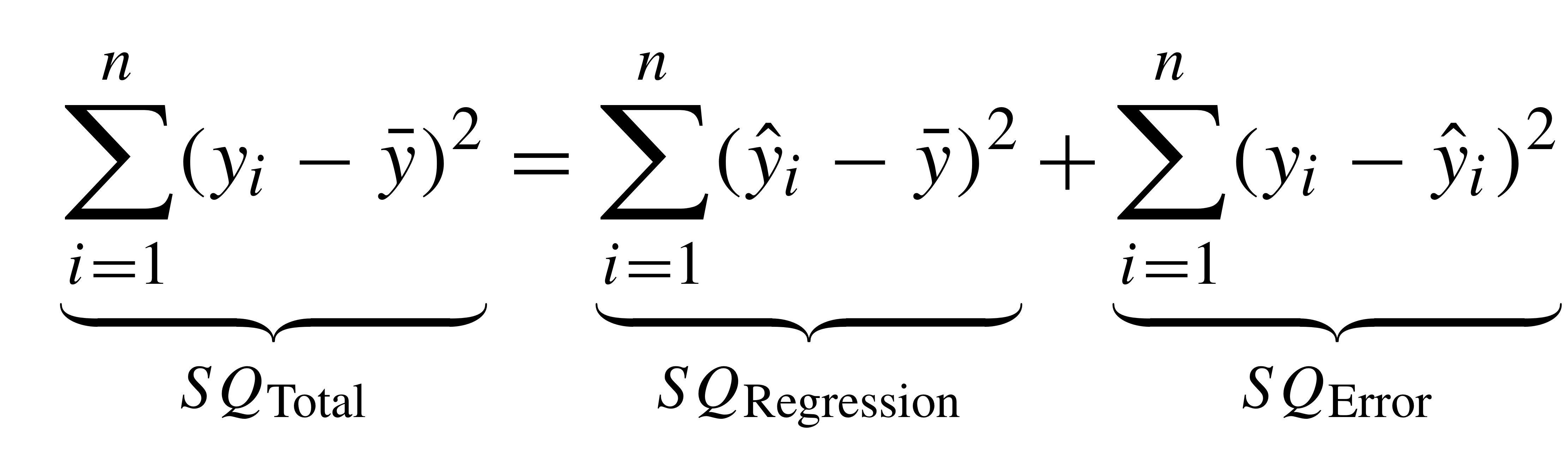
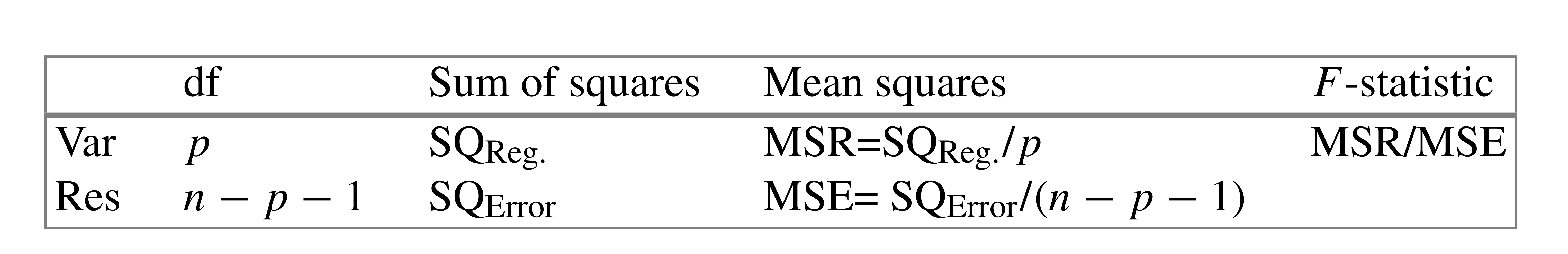
# ANOVA vs linear model
* closely related
* sequential removal of variance - so order of terms matters for ANOVA, not lm
* ANOVA describes amount of variance explained by each term
* no concept of reference level
* if there are multiple levels to a factor, it explains how _all_ levels contribute to variance.
* ANOVA is about variance - no information about direction or size of effect
---
class: smallcode
# ANOVA vs linear model
```{r}
anova(lm(hippocampus ~ Genotype + Sex, baseline))
summary(lm(hippocampus ~ Genotype + Sex, baseline))
```
---
class: smallercode
# $R^2$


---
class: smallercode
 ```{r}
summary(lm(hippocampus ~ Genotype + Sex, baseline))
```
---
class: smallercode
# Interactions
```{r, include=FALSE}
options(width = 1000)
```
```{r}
summary(lm(hippocampus ~ Condition*DaysOfEE, mice))
```
---
class: smallercode
# Interactions
```{r}
mice <- mice %>%
mutate(Condition=factor(Condition, levels=
c("Standard", "Isolated Standard", "Exercise", "Enriched")))
summary(lm(hippocampus ~ Condition*DaysOfEE, mice))
```
---
class: smallcode
# Interacations
```{r, fig.height=5, fig.width=12}
l1 <- lm(hippocampus ~ DaysOfEE + Condition, mice)
l2 <- lm(hippocampus ~ DaysOfEE * Condition, mice)
mice <- mice %>%
mutate(fittedl1 = fitted(l1),
fittedl2 = fitted(l2))
```
.pull-left[
```{r, fig.height=4, fig.width=5}
ggplot(mice) +
aes(x=DaysOfEE, y=hippocampus, colour=Condition) +
geom_point() +
geom_smooth(aes(y=fittedl1), method="lm", se=F) +
theme(legend.position = "none")
```
]
.pull-right[
```{r, fig.height=4, fig.width=5}
ggplot(mice) +
aes(x=DaysOfEE, y=hippocampus, colour=Condition) +
geom_point() +
geom_smooth(aes(y=fittedl2), method="lm", se=F) +
theme(legend.position = "none")
```
]
---
# Linear model assumptions
* the model is linear in parameters
* can still fit curves via polynomials, but no non-linear models
--
* mean residual is zero
--
* homoscedasticity - residuals have equal variance
--
* residuals are normally distributed
--
* no autocorrelation of residuals
--
* number of observations must be greater than ncol(X)
--
* no perfect multicollinearity
---
# Linear model assumptions
```{r, fig.height=5, fig.width=12}
l1 <- lm(hippocampus ~ Condition*DaysOfEE, mice)
qplot(fitted(l1), residuals(l1))
```
---
# Mixed effects models
a model containing both _fixed_ and _random_ effects. Can model autocorrelation of variables
$$y = X \beta + Z \mu + \epsilon$$
where
$y$ is the vector of observations
$\beta$ is an unknown vector of fixed effects
$\mu$ is an unknown vector of random effects, with $E(\mu) = 0$ and $textrm(var)(\mu) = G$
$\epsilon$ is an unknown vector of random errors, with mean of 0 ( $E(\epsilon) = 0$ )
$X$ and $Z$ are the design matrices
---
# Linear mixed effects model
R implementation in lme4 package
```
library(lme4)
summary(lmer(hippocampus ~ Condition*DaysOfEE + (1|ID), mice))
```
---
class: smallcode
# Linear mixed effects model
```{r}
library(lme4)
summary(lmer(hippocampus ~ Condition*DaysOfEE + (1|ID), mice))
```
---
# Linear mixed effects model
```{r, fig.height=5, fig.width=12}
l2 <- lmer(hippocampus ~ Condition*DaysOfEE + (1|ID), mice)
qplot(fitted(l2), residuals(l2))
```
---
# Linear mixed effects model
```{r}
anova(lmer(hippocampus ~ Condition*DaysOfEE + (1|ID), mice))
```
---
# Review
--
Linear models are the key tool in statistical modelling
--
Additive terms let you infer on multiple covariates while controlling for the rest
--
ANOVAs and linear models are two sides of the same coin
--
Mixed effects models allow for correlated errors - especially longitudinal data
--
generalized linear models available for non gaussian response variables: logistic, poisson, etc.
---
# Null Hypothesis Significance Testing
--
1. Define the distributional assumptions for the random variable of interest
--
1. Formulate the null hypothesis
--
1. Fix a significance value
--
1. Construct a test statistic
--
1. Construct a critical region for the test statistic where H0 is rejected
--
1. Calculate test statistic based on sample values
--
1. If test result is in rejection region, H0 is rejected, H1 is statistically significant
--
1. If test result is not in rejection region, H0 is not rejected and therefore accepted.
---
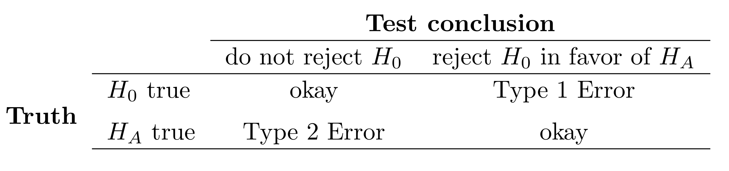
# Types of Errors
---
# Confidence Intervals
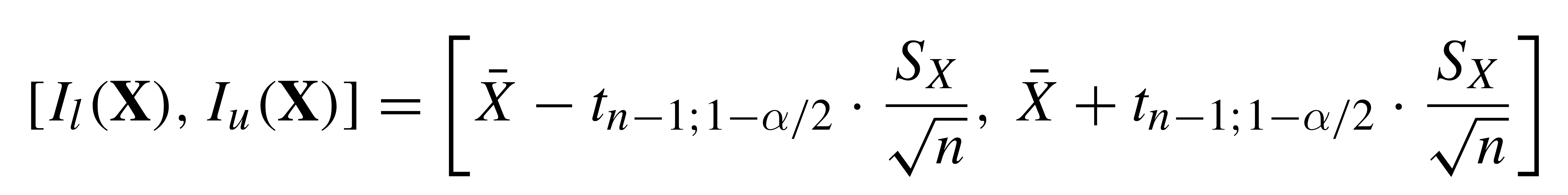
Compute mean of sample
Compute sd of sample
CI = mean ± qt*(sd/sqrt(n))
where qt = 1 for 0.68 interval, 2 for 0.95 interval
---
# Confidence Intervals
```{r, fig.height=4, fig.width=12, echo=F}
confints <- data.frame(lower=vector(length=50), upper=vector(length=50))
for (i in 1:50) { confints[i,] <- confint(lm(sample(baseline$hippocampus, 5)~1), level = 0.68)}
confints$containsMean <- with(confints, mean(baseline$hippocampus) >= lower & mean(baseline$hippocampus) <= upper)
ggplot(confints) + aes(x=1:nrow(confints), ymin=lower, ymax=upper) + geom_errorbar() + geom_hline(yintercept = mean(baseline$hippocampus), colour="red") + xlab("Sample")
ggplot(confints) + aes(x=1:nrow(confints), ymin=lower, ymax=upper, colour=containsMean) + geom_errorbar() + geom_hline(yintercept = mean(baseline$hippocampus), colour="red") + xlab("Sample")
```
---
class: inverse, center, middle
# Logistic regression
(Over to Mehran)
---
## Data and packages for these slides:
```{r, include=TRUE, message=FALSE}
knitr::opts_chunk$set(echo = FALSE)
# required_packages = c("caret", "tree", "randomForest",
# "cowplot", "e1071", "PRROC")
# install.packages(required_packages)
require(tidyverse)
require(cowplot)
mice_df = read_csv("mice.csv")
volume_df = read_csv("volumes.csv")
mice = inner_join(mice_df, volume_df)
```
---
# Generalized linear models
* The linear models assumes that the errors of the dependent variable are normally distributed
* Can you think of any examples in biology or physics that this doesn't happen?
--
* The number of cells you count at different time points after treatment with a new drug
* How are the count data distributed?
--
* The number of sequencing reads mapped to a gene at different time points
--
* Binary outcome: Does increase in alcohol consumption affect cancer occurence?
--
* Approach:
* Model the dependent variable according to a particular distribution
--
* Model the parameters of this distribution according to a link function
---
## Binary variables in mice dataset
Does the striatal volume correlate with haveing an amygdala larger than 10 $mm^3$?
```{r, echo=TRUE, fig.height=5, fig.height=4}
mice$amygdala.group = ifelse(mice$amygdala > 10, 1, 0)
ggplot(mice, aes(x=amygdala.group, y=striatum,
group=amygdala.group)) +
geom_boxplot() +
theme_bw(base_size=18)
```
---
## Linear model for binary variables?
* If the independent variable is binary, can we fit the linear model?
```{r, echo=TRUE, fig.height=3, fig.width=4.5}
ggplot(mice, aes(x=striatum, y=amygdala.group)) +
geom_point() + xlab("Volume of striatum") +
ylab("Amygdala group") +
geom_smooth(method="lm") +
ggtitle("Amygdala group ~ Striatum volume")
```
---
## Why we can't use linear model for classification?
* Suppose we want to predict seizure,
stroke, or overdose given some measurements from patients
--
* If we model them as 1, 2, and 3 respectively, we are assuming order
--
* Even in case of binary variables, our estimates may exceed range of [0, 1],
making the interpretation unnecessarily hard
--
* Any other reasons that contradict assumptions of the linear model?
--
* Read this [blogpost](http://thestatsgeek.com/2015/01/17/why-shouldnt-i-use-linear-regression-if-my-outcome-is-binary), it might be a question on your quiz or final exam.
---
## Logistic function
* $\frac{L}{1 + e^{-k\times (x - \sigma_0)}}$
```{r, echo=TRUE, fig.height=3, fig.width=4}
logistic_function = function(input, curve_max=1,
curve_steepness=1, sig_mid=0){
output = curve_max /
(1 + exp(-curve_steepness * (input - sig_mid)))
}
input_vals = rnorm(50, sd=3)
out_df = data.frame(
X=input_vals, Y=logistic_function(input_vals))
ggplot(out_df, aes(x=X, y=Y)) + geom_line()
```
---
## Linear model for binary variables?
```{r, include=TRUE, fig.height=5, fig.width=10, echo=FALSE}
logm = glm(amygdala.group ~ striatum, data=mice, family="binomial")
pred_df = cbind(mice[,c("striatum", "amygdala", "amygdala.group")],
predict(logm, newdata=mice, type="link", se=TRUE))
pred_df$Group = "Logistic regression"
pred_df$Posterior = plogis(pred_df$fit)
P1 = ggplot(mice, aes(x=striatum, y=amygdala.group)) +
geom_point() + xlab("Volume of striatum") +
ylab("Amygdala group") + ylim(-0.5, 1.5)
P2 = P1 + geom_smooth(method="lm")
P3 = P1 + geom_line(data=pred_df, aes(x=striatum, y=Posterior, group=Group), colour="blue")
plot_grid(P2, P3)
```
---
## Logistic regression as a generalized linear model
* How do we model the dependent variable which has two categories?
--
* What is the probability of two tails in 6 coin flips?
--
* $\dbinom 62 \times 0.5^4 \times (1-0.5)^2$
--
* $\frac{6!}{2! \times (6-2)!} \times 0.5^6 = \frac{15}{64}$
--
* Binomial distribution models number of occurences of a binary event in a certain number of trials
--
* Binomial distribution assumes each observation in the trial is independent
--
* In logistic regression, we model the outcome according to the binomial distribution
--
* We also model the parameters of the binomial distributions using log odds (aka logit) link function
---
## Solving the logistic model
* $Y = \beta_0$ + $\beta X$
--
* $p = p(Y=1)$
--
* $p = \frac{1}{1 + e^{\beta_0 + \beta X}} \rightarrow$ estimating probability with
logistic function
--
* $\frac{p}{1 - p} = e^{\beta_0 + \beta X} \rightarrow$ odds
--
* $\text{ln}(\frac{p}{1 - p}) = \beta_0 + \beta X \rightarrow$ logit or log of odds
--
* In linear model, $\beta$ shows how a unit increase in *X* changes *Y*
--
* The effect size $\beta$ shows how a unit increase in *X* changes log odds
--
* In linear regression, we used least squared to minimize mean squared error
--
* In logistic regression, we aim to maximize the __likelihood__ function
--
* Read the pseudocode for logistic regression [here](https://ml-cheatsheet.readthedocs.io/en/latest/logistic_regression.html)
---
# The likelihood function
* If index $i$ refers to samples that $y = 1$, and index $i^\prime$ refers to sample of class $y = 0$
--
* We want to estimate parameters $\beta$ and $\beta_0$ so that the multiplication of the output of logistic function for samples $i$ by 1 minus the output of logistic function for samples $i^\prime$ is the largest possible value
--
* $l(\beta_0, \beta) = \underset{i:y_i=1}{\Pi} p(x_i) \underset{i^\prime:y_{i^\prime}=0}{\Pi} (1 - p(x_{i^\prime})) \rightarrow$ Likelihood function
--
* Algorithms such as the expectation maximization algorithm, can initialize these parameters by some values and change the values iteratively to obtain the maximum value for the likelihood function
---
# Group assignment #2
.medium[
Start with yesterday's assignment, and add
1. A statistical test of the difference in hippocampal volume by Genotype at the final timepoint.
1. A statistical test of the difference in hippocampal volume by Condition at the final timepoint.
1. A statistical test of the difference in hippocampal volume by Condition and Genotype at the final timepoint.
1. Compute a permutation test of hippocampal volume by Condition and Genotype test, compare p value(s) to what you obtained from the parametric test.
1. A statistical test of the change over time by Condition and Genotype. Make sure to write a description of how to interpret the estimates of each of the terms.
1. Integrate your statistics and visualization (adding new ones or removing old ones where need be) to make your document a cohesive report.
1. Write a summary paragraph interpreting your outcomes.
1. Make sure that all team members are listed as authors.
1. Any questions: ask here in person, or email us (jason.lerch@ndcn.ox.ac.uk, mehran.karimzadehreghbati@mail.utoronto.ca) and we promise to answer quickly.
]
```{r}
summary(lm(hippocampus ~ Genotype + Sex, baseline))
```
---
class: smallercode
# Interactions
```{r, include=FALSE}
options(width = 1000)
```
```{r}
summary(lm(hippocampus ~ Condition*DaysOfEE, mice))
```
---
class: smallercode
# Interactions
```{r}
mice <- mice %>%
mutate(Condition=factor(Condition, levels=
c("Standard", "Isolated Standard", "Exercise", "Enriched")))
summary(lm(hippocampus ~ Condition*DaysOfEE, mice))
```
---
class: smallcode
# Interacations
```{r, fig.height=5, fig.width=12}
l1 <- lm(hippocampus ~ DaysOfEE + Condition, mice)
l2 <- lm(hippocampus ~ DaysOfEE * Condition, mice)
mice <- mice %>%
mutate(fittedl1 = fitted(l1),
fittedl2 = fitted(l2))
```
.pull-left[
```{r, fig.height=4, fig.width=5}
ggplot(mice) +
aes(x=DaysOfEE, y=hippocampus, colour=Condition) +
geom_point() +
geom_smooth(aes(y=fittedl1), method="lm", se=F) +
theme(legend.position = "none")
```
]
.pull-right[
```{r, fig.height=4, fig.width=5}
ggplot(mice) +
aes(x=DaysOfEE, y=hippocampus, colour=Condition) +
geom_point() +
geom_smooth(aes(y=fittedl2), method="lm", se=F) +
theme(legend.position = "none")
```
]
---
# Linear model assumptions
* the model is linear in parameters
* can still fit curves via polynomials, but no non-linear models
--
* mean residual is zero
--
* homoscedasticity - residuals have equal variance
--
* residuals are normally distributed
--
* no autocorrelation of residuals
--
* number of observations must be greater than ncol(X)
--
* no perfect multicollinearity
---
# Linear model assumptions
```{r, fig.height=5, fig.width=12}
l1 <- lm(hippocampus ~ Condition*DaysOfEE, mice)
qplot(fitted(l1), residuals(l1))
```
---
# Mixed effects models
a model containing both _fixed_ and _random_ effects. Can model autocorrelation of variables
$$y = X \beta + Z \mu + \epsilon$$
where
$y$ is the vector of observations
$\beta$ is an unknown vector of fixed effects
$\mu$ is an unknown vector of random effects, with $E(\mu) = 0$ and $textrm(var)(\mu) = G$
$\epsilon$ is an unknown vector of random errors, with mean of 0 ( $E(\epsilon) = 0$ )
$X$ and $Z$ are the design matrices
---
# Linear mixed effects model
R implementation in lme4 package
```
library(lme4)
summary(lmer(hippocampus ~ Condition*DaysOfEE + (1|ID), mice))
```
---
class: smallcode
# Linear mixed effects model
```{r}
library(lme4)
summary(lmer(hippocampus ~ Condition*DaysOfEE + (1|ID), mice))
```
---
# Linear mixed effects model
```{r, fig.height=5, fig.width=12}
l2 <- lmer(hippocampus ~ Condition*DaysOfEE + (1|ID), mice)
qplot(fitted(l2), residuals(l2))
```
---
# Linear mixed effects model
```{r}
anova(lmer(hippocampus ~ Condition*DaysOfEE + (1|ID), mice))
```
---
# Review
--
Linear models are the key tool in statistical modelling
--
Additive terms let you infer on multiple covariates while controlling for the rest
--
ANOVAs and linear models are two sides of the same coin
--
Mixed effects models allow for correlated errors - especially longitudinal data
--
generalized linear models available for non gaussian response variables: logistic, poisson, etc.
---
# Null Hypothesis Significance Testing
--
1. Define the distributional assumptions for the random variable of interest
--
1. Formulate the null hypothesis
--
1. Fix a significance value
--
1. Construct a test statistic
--
1. Construct a critical region for the test statistic where H0 is rejected
--
1. Calculate test statistic based on sample values
--
1. If test result is in rejection region, H0 is rejected, H1 is statistically significant
--
1. If test result is not in rejection region, H0 is not rejected and therefore accepted.
---
# Types of Errors

---
# Confidence Intervals

Compute mean of sample
Compute sd of sample
CI = mean ± qt*(sd/sqrt(n))
where qt = 1 for 0.68 interval, 2 for 0.95 interval
---
# Confidence Intervals
```{r, fig.height=4, fig.width=12, echo=F}
confints <- data.frame(lower=vector(length=50), upper=vector(length=50))
for (i in 1:50) { confints[i,] <- confint(lm(sample(baseline$hippocampus, 5)~1), level = 0.68)}
confints$containsMean <- with(confints, mean(baseline$hippocampus) >= lower & mean(baseline$hippocampus) <= upper)
ggplot(confints) + aes(x=1:nrow(confints), ymin=lower, ymax=upper) + geom_errorbar() + geom_hline(yintercept = mean(baseline$hippocampus), colour="red") + xlab("Sample")
ggplot(confints) + aes(x=1:nrow(confints), ymin=lower, ymax=upper, colour=containsMean) + geom_errorbar() + geom_hline(yintercept = mean(baseline$hippocampus), colour="red") + xlab("Sample")
```
---
class: inverse, center, middle
# Logistic regression
(Over to Mehran)
---
## Data and packages for these slides:
```{r, include=TRUE, message=FALSE}
knitr::opts_chunk$set(echo = FALSE)
# required_packages = c("caret", "tree", "randomForest",
# "cowplot", "e1071", "PRROC")
# install.packages(required_packages)
require(tidyverse)
require(cowplot)
mice_df = read_csv("mice.csv")
volume_df = read_csv("volumes.csv")
mice = inner_join(mice_df, volume_df)
```
---
# Generalized linear models
* The linear models assumes that the errors of the dependent variable are normally distributed
* Can you think of any examples in biology or physics that this doesn't happen?
--
* The number of cells you count at different time points after treatment with a new drug
* How are the count data distributed?
--
* The number of sequencing reads mapped to a gene at different time points
--
* Binary outcome: Does increase in alcohol consumption affect cancer occurence?
--
* Approach:
* Model the dependent variable according to a particular distribution
--
* Model the parameters of this distribution according to a link function
---
## Binary variables in mice dataset
Does the striatal volume correlate with haveing an amygdala larger than 10 $mm^3$?
```{r, echo=TRUE, fig.height=5, fig.height=4}
mice$amygdala.group = ifelse(mice$amygdala > 10, 1, 0)
ggplot(mice, aes(x=amygdala.group, y=striatum,
group=amygdala.group)) +
geom_boxplot() +
theme_bw(base_size=18)
```
---
## Linear model for binary variables?
* If the independent variable is binary, can we fit the linear model?
```{r, echo=TRUE, fig.height=3, fig.width=4.5}
ggplot(mice, aes(x=striatum, y=amygdala.group)) +
geom_point() + xlab("Volume of striatum") +
ylab("Amygdala group") +
geom_smooth(method="lm") +
ggtitle("Amygdala group ~ Striatum volume")
```
---
## Why we can't use linear model for classification?
* Suppose we want to predict seizure,
stroke, or overdose given some measurements from patients
--
* If we model them as 1, 2, and 3 respectively, we are assuming order
--
* Even in case of binary variables, our estimates may exceed range of [0, 1],
making the interpretation unnecessarily hard
--
* Any other reasons that contradict assumptions of the linear model?
--
* Read this [blogpost](http://thestatsgeek.com/2015/01/17/why-shouldnt-i-use-linear-regression-if-my-outcome-is-binary), it might be a question on your quiz or final exam.
---
## Logistic function
* $\frac{L}{1 + e^{-k\times (x - \sigma_0)}}$
```{r, echo=TRUE, fig.height=3, fig.width=4}
logistic_function = function(input, curve_max=1,
curve_steepness=1, sig_mid=0){
output = curve_max /
(1 + exp(-curve_steepness * (input - sig_mid)))
}
input_vals = rnorm(50, sd=3)
out_df = data.frame(
X=input_vals, Y=logistic_function(input_vals))
ggplot(out_df, aes(x=X, y=Y)) + geom_line()
```
---
## Linear model for binary variables?
```{r, include=TRUE, fig.height=5, fig.width=10, echo=FALSE}
logm = glm(amygdala.group ~ striatum, data=mice, family="binomial")
pred_df = cbind(mice[,c("striatum", "amygdala", "amygdala.group")],
predict(logm, newdata=mice, type="link", se=TRUE))
pred_df$Group = "Logistic regression"
pred_df$Posterior = plogis(pred_df$fit)
P1 = ggplot(mice, aes(x=striatum, y=amygdala.group)) +
geom_point() + xlab("Volume of striatum") +
ylab("Amygdala group") + ylim(-0.5, 1.5)
P2 = P1 + geom_smooth(method="lm")
P3 = P1 + geom_line(data=pred_df, aes(x=striatum, y=Posterior, group=Group), colour="blue")
plot_grid(P2, P3)
```
---
## Logistic regression as a generalized linear model
* How do we model the dependent variable which has two categories?
--
* What is the probability of two tails in 6 coin flips?
--
* $\dbinom 62 \times 0.5^4 \times (1-0.5)^2$
--
* $\frac{6!}{2! \times (6-2)!} \times 0.5^6 = \frac{15}{64}$
--
* Binomial distribution models number of occurences of a binary event in a certain number of trials
--
* Binomial distribution assumes each observation in the trial is independent
--
* In logistic regression, we model the outcome according to the binomial distribution
--
* We also model the parameters of the binomial distributions using log odds (aka logit) link function
---
## Solving the logistic model
* $Y = \beta_0$ + $\beta X$
--
* $p = p(Y=1)$
--
* $p = \frac{1}{1 + e^{\beta_0 + \beta X}} \rightarrow$ estimating probability with
logistic function
--
* $\frac{p}{1 - p} = e^{\beta_0 + \beta X} \rightarrow$ odds
--
* $\text{ln}(\frac{p}{1 - p}) = \beta_0 + \beta X \rightarrow$ logit or log of odds
--
* In linear model, $\beta$ shows how a unit increase in *X* changes *Y*
--
* The effect size $\beta$ shows how a unit increase in *X* changes log odds
--
* In linear regression, we used least squared to minimize mean squared error
--
* In logistic regression, we aim to maximize the __likelihood__ function
--
* Read the pseudocode for logistic regression [here](https://ml-cheatsheet.readthedocs.io/en/latest/logistic_regression.html)
---
# The likelihood function
* If index $i$ refers to samples that $y = 1$, and index $i^\prime$ refers to sample of class $y = 0$
--
* We want to estimate parameters $\beta$ and $\beta_0$ so that the multiplication of the output of logistic function for samples $i$ by 1 minus the output of logistic function for samples $i^\prime$ is the largest possible value
--
* $l(\beta_0, \beta) = \underset{i:y_i=1}{\Pi} p(x_i) \underset{i^\prime:y_{i^\prime}=0}{\Pi} (1 - p(x_{i^\prime})) \rightarrow$ Likelihood function
--
* Algorithms such as the expectation maximization algorithm, can initialize these parameters by some values and change the values iteratively to obtain the maximum value for the likelihood function
---
# Group assignment #2
.medium[
Start with yesterday's assignment, and add
1. A statistical test of the difference in hippocampal volume by Genotype at the final timepoint.
1. A statistical test of the difference in hippocampal volume by Condition at the final timepoint.
1. A statistical test of the difference in hippocampal volume by Condition and Genotype at the final timepoint.
1. Compute a permutation test of hippocampal volume by Condition and Genotype test, compare p value(s) to what you obtained from the parametric test.
1. A statistical test of the change over time by Condition and Genotype. Make sure to write a description of how to interpret the estimates of each of the terms.
1. Integrate your statistics and visualization (adding new ones or removing old ones where need be) to make your document a cohesive report.
1. Write a summary paragraph interpreting your outcomes.
1. Make sure that all team members are listed as authors.
1. Any questions: ask here in person, or email us (jason.lerch@ndcn.ox.ac.uk, mehran.karimzadehreghbati@mail.utoronto.ca) and we promise to answer quickly.
]